Is it Time to Re-imagine the Face of Your Franchise?
 

When a customer steps into your storefront, are they immediately engaged in your brand and compelled to buy? Does your store layout support the desired customer experience? Do you have the right design and flow that makes it easy and appealing for your customers? If not, then your in-store marketing is costing you money – and it’s time to reverse that trend.

Consumers today are more educated, more demanding, and have more options than ever before. It’s critically important for retailers to keep up with the ever-evolving consumer needs and stay top of mind. Adapting a new franchise model or updating your business space to meet these consumer demands can lead to projects as diverse in scope as they are in size. Executing the upgrade of a single element related to branding and signage programs - such as displays, store fixtures, or kiosks - can do wonders in terms of maximizing efficiency and enjoyment for consumers.

A recent benchmark survey by Retail Touch Points indicated that retailers continue to rethink their spaces after undergoing massive transformations in 2020 (57% of respondents said they renovated stores in some form last year). This trend is expected to continue well into 2021 with more than half of respondents planning to renovate the same number, if not more stores as compared to last year.

Whether it’s a simple signage upgrade or throwing out a tired blueprint in favour of a new, more relevant and contemporary image, the end goal remains the same: keeping up with consumer demands, and translating your brand into functional, useful retail experiences that connect consumers with your products in an easy, efficient, and memorable way.

Looking for some inspiration? In today’s modern retail, there are three notable trends that are catching the attention of consumers:

Experiential Retail – Extreme Branding and Consumer Engagement

One of the hottest retail trends in the last couple of years is creating a showroom-style retail environment, in which branding is exaggerated in a unique way. It’s innovative, interactive, and intentionally intriguing, drawing consumers in and allowing them to experience one-of-a-kind moments with the brand.

Quick Serve/Self-Serve (Digital integration)

Digital self-serve kiosks have become more and more mainstream in multiple environments due to increasing consumer demand. Self-serve checkouts at local grocery and hardware stores have been around for years, and now hospitality and entertainment venues have been adapting to this trend with digital kiosks that allow patrons to order food or movie tickets.

Marketing Communication

Taking advantage of every opportunity to talk to consumers, in a tasteful way, is a must these days. Retailers can relatively easily leverage storefronts for effective and impactful messaging. In the same vein as experiential retail, interesting and inviting visuals can be used to capture attention, pique curiosity, and turn a passer-by into a walk-in through eye-catching brand engagement.

Our world is different now and it continues to change rapidly. How people interact with brands in retail settings is definitely part of that changing landscape. Consumers are more informed, have more ways to shop and have more options than ever. Brand marketing is more complex than ever too, with the engagement between the brand and the consumer growing into a continuum that leads to the moment of purchase. This journey is now driven by the consumer, but the way in-store marketing weaves into the overall brand experience will drive purchase behaviour. If your brand isn’t motivating this relationship and creating positive interactions in your stores, it’s time to do something. Just look at your space and try to re-imagine what’s possible…


About the Author

Kelly Macht has over 20 years of experience helping brands connect better with their clients. With an extensive background in sales, cultivating growth opportunities as well as client and stakeholder management, she helps to turn partner goals into fully supported and successful action plans.


Share this story. Choose your platform!

Michael Flotner
From Sketch to Reality: The Power of Sketching in the Design Process
 

Design sketching – the process of visualizing concepts by hand can be a powerful tool. As designers, we love to sketch. It’s the excitement of creating something new and the opportunity a blank canvas presents. Design sketching is thinking visualized and helps our team to bring to life our client’s discussions, thoughts, ideas, and solutions right in front of their eyes. It is also a lot of fun for all involved – especially to those who are unpracticed – in the magic of watching ideas take form.

Often sketching is overlooked as an important stage in design development – in favor of jumping straight to computer-based approaches. But sketching allows for exploration and the fluidity of sketch allows one to move through ideas effortlessly. Its low fidelity means there is less friction in the process, and we don’t get hung up on details that are not important. Ideas have space to flow, and there is a momentum and energy created by sketching where to brainstorming process accelerates as visual feed into new ideas and back into new sketches. In client brainstorms, we encourage the unpracticed to sketch too! Design sketching is not about creating a beautiful image it is about exploring a beautiful idea.

In some cases, we use sketches to outline quick visuals of potential directions to clients in the design discovery stage. These sketches often match quite closely with the final result.

S2R-AT.png

Sometimes the sketches are quick, gestural to provide feedback to our internal team – they capture the spirit of the project at hand.

S2R-POW.png

Finally, we often use sketches to quickly explore concept directions to align a larger team of stakeholders on a direction for the project as with this Flagship TV showroom designed for Samsung.

S2R-SES.png

From what we’ve described above, you can see why sketching is an important first step into the ideation phase of any project. To see some of the results, we’ve included some examples below. Surprisingly, those simple first sketches often turn out to be quite close to the final result.


Share this story. Choose your platform!

Michael Flotner
The Best Lottery Retail Store Design – Washington's Lottery Department of Imagination
 

At Blake Jarrett & Company (BJ&Co), we live and breathe retail design. We understand the importance of the consumer journey, and meticulously design every last detail to deliver the best experience possible, no matter what the environment.  We’ve been busy at BJ&Co working on one of the US Lotteries first to market flagship retail store for Washington State Lottery. The flagship store, The Department of Imagination, is located in Spokane, Washington.

It was a great honour to have the opportunity to take this retail store design from concept through to completion. Working on a team of experts across the industry, BJ&Co designed, engineered and manufactured the “Department of Imagination”, showcasing a new and innovative, best-in-class approach to lottery retail design. The intention of the space was to allow consumers a spot to learn about the lottery, play and redeem winning tickets in a fun dynamic environment.

Picture1.jpg

Blake Jarrett and Company was commissioned by Washington’s Lottery through Wunderman Thompson, to design and outfit their new “Dept of Imagination” retail store. Intrigued by some of BJ&Co’s previous work in the lottery industry, Washington’s Lottery were excited to work alongside a trusted partner to help guide the strategy behind this new space.

The Washington’s Lottery Department of Imagination features digital, interactive and graphic menu boards throughout the store. The high visibility of these key features continues to draw in consumers both reoccurring and new.

The Washington’s Lottery Department of Imagination features digital, interactive and graphic menu boards throughout the store. The high visibility of these key features continues to draw in consumers both reoccurring and new.

In conjunction with Washington’s Lottery, IGT, Wunderman Thompson, NCI, Optika Display, and Carmanah, BJ&Co led the new store build project from its conceptual design phase through to store completion, loaning our industrial/retail design and manufacturing expertise to the development of a new innovative lottery space.

Inspired by the notion that the Department of Imagination store needed to become a destination as opposed to a ‘quick stop’ for the lottery consumer, BJ&Co worked with the other project partners to develop a cohesive strategy for the build that made the best sense for the brand and that would create an environment with staying power.

Imagination Tables equipped with COVID-19 acrylic shields & hand sanitizer station for consumer safety considerations. Interactive touch screen for consumers to enjoy an in-store lottery experience.

Imagination Tables equipped with COVID-19 acrylic shields & hand sanitizer station for consumer safety considerations. Interactive touch screen for consumers to enjoy an in-store lottery experience.

The store design captures interactive-touch screen technologies, a ‘Winners Lounge’ and a beautifully crafted display case which has the capacity to display the Lottery’s full selection of full-size tickets, as well as a Featured tickets area. This immersive space allows the current lottery consumers to come to enjoy the lottery that they love, but also rediscover it in a new way.

The Service Area (above) integrates the illuminated scratch ticket display case, lottery branding and fully dynamic menu board system. Meticulous detail was considered to accommodate all of the POS, peripherals, accessibility requirements and ticket…

The Service Area (above) integrates the illuminated scratch ticket display case, lottery branding and fully dynamic menu board system. Meticulous detail was considered to accommodate all of the POS, peripherals, accessibility requirements and ticket inventory considerations.

Since the store opening was during the current pandemic, BJ&Co designed a sophisticated, custom COVID-19 safety solutions kit, including quality branded acrylic shields for all counters and imagination tables, hand sanitizer stations, and safety way-finding graphics to ensure 6 FT apart safety for all consumers and employees. It was imperative that BJ&Co made sure consumers would feel safe and comfortable within the space, as part of a positive consumer experience.

To date, the store has over-performed up to 3.6x the projected weekly sales, despite the current retail challenges presented by the pandemic.

Returning customers, as well as many new, comment that their curiosity is peaked by the overall design/new look and feel of the lottery store. Their interest in both the lottery offerings and the design have contributed the store’s amazing success! Here at BJ&Co we are so excited to see what is in store for year one, for this new retail space! So grateful to have been a part of this amazing journey. Looking forward to the next collaboration Washington Lottery!


Share this story. Choose your platform!

Michael Flotner
Best Innovation in Lottery Retail
 

At Blake Jarrett & Company, we understand the importance of staying relevant in a constantly changing retail landscape. As a trusted, longtime manufacturing partner for OLG, with proven success in developing their flagship retail kiosks, Blake Jarrett & Company was once again approached by OLG to develop an innovative solution, and to re-imagine Lottery Retail as their fleet of Playstands were aging in today’s digital world.

IMAGE+2_V2.jpg

Blake Jarrett & Company was tasked by OLG to modernize the customer experience through digital innovation on a physical, custom retail display. The new playstand needed to engage the customer through digital interaction and offer new marketing and gaming opportunities that would excite the customer. In addition to this, it was just as important to ensure the new playstand was functional and durable in a high traffic environment, as well as accessible therefore bringing it in line with the current accessible design standards (and AODA compliance). Blake Jarrett & Company’s smart design was modular, and could easily be updated throughout its lifespan keeping ongoing costs low, while at the same time being able to accommodate technology and new product launches.

Here at Blake Jarrett & Company we understand the importance of perfecting the consumer journey from beginning to end. OLG relied on us BJ&Co to re-invent the customer experience in its field operations to help them achieve their goals every step of the way.  To this end, OLG partnered with Blake Jarrett & Company as their full-service partner from conception to completion. Blake Jarrett & Company was responsible for research, design, engineering, prototype, manufacturing, shipping and installation of the first to market digital playstand. We worked closely with OLG every step of the way, walking them through design rationale, and listened carefully to their feedback and input, thus creating a collaborative partnership.

The key design philosophy was modularity. Giving OLG the ability to swap out components in the field allowed them to roll out the units in either a digital (with a touchscreen display) or manual (illuminated static graphic) configuration. At key points in the design process we created physical mockups to better realize our vision: full size foam-core mockups for general ergonomics and styling, wood MDF mockups for user testing and final approval of design, miniature functional mockups for stakeholder engagement and finally first-off production units to perfect all the details.

IMAGE 3.jpg

The unit was designed with all customers in mind and to comply with upcoming AODA accessibility legislation. The writing surface was designed at an accessible height. Significant areas of the interactive touchscreen were at an accessible height and a touchpad was integrated into the body of the writing surface so that maximum flexibility was provided for customers to receive an amazing experience.  

IMAGE 5.jpg

Materials were selected for manufacturing that ensure a durable product with a long functional life, but also so that the units can be recycled or repurposed at their end of life. 96% of the playstand by weight is recyclable using standard recycling methods. 

IMAGE 6.jpg

End result, Blake Jarrett delivered an innovative solution to Lottery Retail which enhanced the customer experience. THE OLG digital playstand is innovative, modular, ergonomic, and accessible in over 2,000 locations.

Many thanks to the OLG Team for the collaborative effort in bringing this to life.


Share this story. Choose your platform!

Michael Flotner
The Best Cannabis Retail Experience at Superette
 

Here at Blake Jarrett and Company, we thrive on a good design challenge. There is nothing more rewarding then seeing the magic of a doodle become a real-life, tangible thing that consumers can interact with and experience.

Superette, the hottest new Cannabis shop in Toronto – and our customer – delivered one of the biggest highs when seeing the retail design doodles come to life in a big way! Drummond Munroe, Co-Founder of Superette had a vision for his retro Cannabis shops. Their first location on Rideau Street in Ottawa was having great success. However, Drummond knew there was an opportunity to refine the design for future stores to even further enhance the Cannabis retail experience. After a few inspirational conversations, Blake Jarrett and Company was chosen as a retail design partner to help elevate the retail experience for future stores.  We did just that with their latest store on Yonge Street in the Toronto neighborhood of Summerhill, with more to follow. 

 
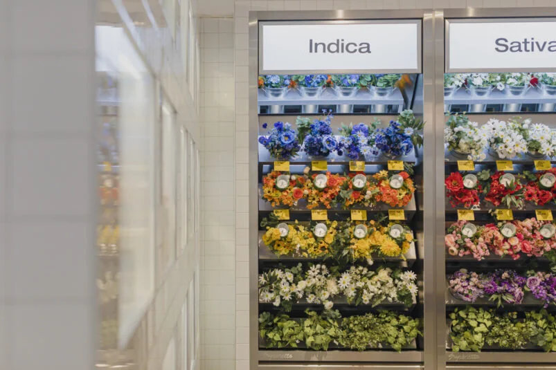
flower-wall.jpg
 

The inspiration for the store design was derived from Drummond’s big vision of a retro diner, supermarket, flower shop look and feel. These were unconventional cannabis retail designs, and while the Cannabis sector was new to Blake Jarrett and Company, our team was thrilled to take on this new challenge. The vision was clear, and we knew it was going to be a journey from conception to completion.

Working with Dani Hall of Design of Brand (DOB) and Trevor McArthur of CMG it wasn’t always easy wrapping our heads around some of the eccentric ideas. Sometimes, with custom display manufacturing there is a natural tendency to resort to the conventional, in this case we were lucky to have joined a team that was committed to excellence and committed to creating a unique retail experience. From bud flower walls to digital menu kiosks, island coolers, and merchandise fixtures, what we learned along the way was to expect the unexpected from Superette! A good example of this is the digital menu kiosks. We have designed and manufactured countless contemporary digital kiosks for various businesses (i.e., entertainment, retail, lottery), but we have never been asked to design and engineer one that is reminiscent of the old-school cigarette machines, chunky and old looking!

 
menu.jpg
 

The ultimate in cannabis customer retail experience is the flower wall. We were tasked with creating an experiential bud flower wall that resembled a bodega flower shop. The wall was to be the center of attraction as well as interactive and educational for consumers. Nestled in the beautiful flower wall are 24 bud pods, custom designed and carefully engineered to showcase the bud flowers in an enclosed pod while at the same time allowing customers to get a better sense of the product.  The bud pods are clear, with discreet holes so the customer can experience the distinct aroma each bud has to offer. To get a better sense, each bud pod has a retractable wire that lets customer pick up the bud pods from the flower bouquets and experience it up close and personal to help them with their cannabis journey. The whimsical customer experience is fun as well as informative. On top of that, the bud pods were designed to be functional and efficient each with it’s own humidity pack in the base to keep the buds fresh and aromatic at all times.

Since the Yonge Street location opened, we’ve seen numerous articles and social media posts, surrounding this unique cannabis retail experience at Superette. The flower wall and digital menu kiosk has created quite the buzz in the cannabis retail sector. For Blake Jarrett & Company, it’s a fantastic example of how we can take big ideas and bring them to life with an outspend execution. Blake Jarrett & Company prides itself on big ideas that work, executing our customer’s vision, and Superette demonstrates just that from doodles to execution.  We can proudly say mission accomplished.

Thank you to the entire Superette team for bringing us in on this exciting project. It is our biggest retail design, custom display, and in stores fixture project within the cannabis industry to date. We are excited to work together on future projects.

  All photos credit K Rocca via Superette.
 

Share this story. Choose your platform!